# 辅助类(核心)
# 简介
辅助类是将业务中典型的样式场景提炼为 class 类名,这在开发相关 sass系统 这种弱 UI 系统能够大大提高开发效率。
# 文字和背景颜色
文字颜色(颜色名)
<div class="red">red</div>
<div class="gray-200">gray-200</div>
<div class="teal">teal</div>
1
2
3
2
3

背景颜色(bg-颜色名)
<div class="bg-red">red</div>
<div class="bg-gray-200">gray-200</div>
<div class="bg-teal">teal</div>
1
2
3
2
3

# 浮动
<!-- 清除浮动 -->
<div class="clearfix">
    <div class="fl">左浮动</div>
    <div class="fr">右浮动</div>
</div>
1
2
3
4
5
2
3
4
5
TIP
浮动在布局中已经很少使用,推荐使用flex替换浮动
# 文字相关
<!-- 文字相关 -->
<div style="width: 200px;" class="mb-1 text-normal">正常字体</div>
<div style="width: 200px;" class="mb-1 text-bold">加粗字体</div>
<div style="width: 200px;" class="mb-1 text-light">轻量字体</div>
<div style="width: 200px;" class="mb-1 text-left border">left</div>
<div style="width: 200px;" class="mb-1 text-center border">center</div>
<div style="width: 200px;" class="mb-1 text-right border">right</div>
<div style="width: 200px;" class="mb-1 text-nowrap border">nowrap nowrap nowrap nowrap nowrap nowrap</div>
1
2
3
4
5
6
7
8
2
3
4
5
6
7
8

# 定位相关
<!-- 定位相关 -->
<div style="width: 200px;" class="p-absolute">绝对定位</div>
<div style="width: 200px;" class="p-relative">相对定位</div>
<div style="width: 200px;" class="p-static">默认定位</div>
<div style="width: 200px;" class="p-sticky">粘粘定位</div>
1
2
3
4
5
2
3
4
5
# 垂直对齐相关
<!-- 垂直对齐相关 -->
<span class="align-top">这是一段文本</span>
<span class="align-middle">这是一段文本</span>
<span class="align-baseline">这是一段文本</span>
<span class="align-text-bottom">这是一段文本</span>
<span class="align-text-top">这是一段文本</span>
1
2
3
4
5
6
2
3
4
5
6
TIP
实际开发中使用的频率比较低
# 边框(border)
<!-- 边框(border) -->
<div style="width: 100px; height: 100px;" class="ml-1 border-left-red"></div>
<div style="width: 100px; height: 100px;" class="ml-1 border-green"></div>
<div style="width: 100px; height: 100px;" class="ml-1 border-gray-300"></div>
1
2
3
4
2
3
4

# 光标效果
<!-- 鼠标相关 -->
<div class="ml-1 cursor-pointer"></div>
<div class="ml-1 cursor-help"></div>
<div class="ml-1 cursor-not-allowed"></div>
<div class="ml-1 cursor-default"></div>
1
2
3
4
5
2
3
4
5
TIP
只支持部分cursor效果,常用 cursor-pointer cursor-not-allowed cursor-default
# 阴影效果
<!-- 阴影相关 -->
<div style="width: 100px; height: 100px;" class="ml-1 box-shadow-sm"></div>
<div style="width: 100px; height: 100px;" class="ml-1 box-shadow-base"></div>
<div style="width: 100px; height: 100px;" class="ml-1 box-shadow-bg"></div>
1
2
3
4
2
3
4

# 圆角效果
<!-- 圆角相关 -->
<div style="width: 70px; height: 70px;" class="ml-1 radius-xs border-teal"></div>
<div style="width: 70px; height: 70px;" class="ml-1 radius-sm border-teal"></div>
<div style="width: 70px; height: 70px;" class="ml-1 radius-base border-teal"></div>
<div style="width: 70px; height: 70px;" class="ml-1 radius-sm border-teal"></div>
<div style="width: 70px; height: 70px;" class="ml-1 radius-sm border-teal"></div>
1
2
3
4
5
6
2
3
4
5
6

# margin相关
<!-- 间距相关 -->
<div style="width: 70px; height: 70px;" class="ml-1 border-teal"></div>
<div style="width: 70px; height: 70px;" class="ml-2 border-teal"></div>
<div style="width: 70px; height: 70px;" class="ml-3 border-teal"></div>
<div style="width: 70px; height: 70px;" class="pl-1 border-teal"></div>
<div style="width: 70px; height: 70px;" class="pl-2 border-teal"></div>
<div style="width: 70px; height: 70px;" class="pl-3 border-teal"></div>
<!-- 特殊 -->
<div style="width: 70px; height: 70px;" class="m-atuo border-teal">margin: auto</div>
<div style="width: 70px; height: 70px;" class="ml-auto border-teal">margin-left: auto</div>
<div style="width: 70px; height: 70px;" class="mr-auto border-teal">margin-right: auto</div>
<div style="width: 70px; height: 70px;" class="no-margin border-teal">padding: 0!important</div>
<div style="width: 70px; height: 70px;" class="no-padding border-teal">margin: 0!important</div>
1
2
3
4
5
6
7
8
9
10
11
12
13
2
3
4
5
6
7
8
9
10
11
12
13

# 字体大小
<!-- 文字大小相关 -->
<div class="mr-2 f-xs">好好学习</div>
<div class="mr-2 f-sm">好好学习</div>
<div class="mr-2 f-base">好好学习</div>
<div class="mr-2 f-bg">好好学习</div>
<div class="mr-2 f-lg">好好学习</div>
<div class="mr-2 f-ex">好好学习</div>
1
2
3
4
5
6
7
2
3
4
5
6
7

# flex布局(常用)
flex 布局类名都必须包含 d-flex d-inline-flex
<div class="d-flex j-* a-*"></div>
1
| 类名 | 对应css |
|---|---|
| d-flex d-inline-flex | display: flex inline-flex |
| a-start | align-items: flex-start |
| a-end | align-items: flex-end |
| a-center | align-items: center |
| j-start | justify-content: flex-start |
| j-end | justify-content: flex-end |
| j-center | justify-content: center |
| j-between | justify-content: space-between |
| j-around | justify-content: space-around |
| j-evenly | justify-content: space-evenly |
| flex-center | justify-content: center;align-items: center |
| center | 同上(不推荐使用,命名不清晰,下个版本废除) |
| flex-row | flex-direction: row |
| flex-column | flex-direction: column |
| 特殊 | 对应css |
|---|---|
| flex1 | flex: 1 |
TIP
部分属性因使用频率过低未被列出,详细flex布局可以参考 flex align-items justify-content
# 宽高相关(常用)
宽高按照5份进行分隔,最大为 100,绝对长度(px)按照 50px - 1000px进行分隔。
<!-- 百分比宽高 -->
<div class="w-5">width: 5%</div>
<div class="w-100">width: 100%</div>
<div class="h-5">height: 5%</div>
<div class="h-100">height: 100%</div>
<!-- 视口比例宽高 -->
<div class="vw-5">width: 5vw</div>
<div class="vw-100">width: 100vw</div>
<div class="vh-5">height: 5vh</div>
<div class="vh-100">height: 100vh</div>
<!-- 绝对长度宽高 -->
<div class="w-50px">width: 50px</div>
<div class="h-1000px">width: 1000px</div>
<div class="v-50px">height: 50px</div>
<div class="v-1000px">height: 1000px</div>
1
2
3
4
5
6
7
8
9
10
11
12
13
14
15
2
3
4
5
6
7
8
9
10
11
12
13
14
15
# hover效果
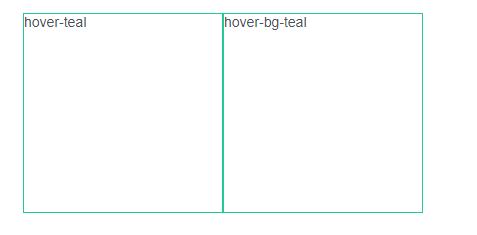
文本颜色hover效果 hover + 颜色值
背景颜色hover效果 hover + + bg + 颜色值
<div class="w-200px h-200px border-teal hover-teal">hover-teal</div>
<div class="w-200px h-200px border-teal hover-bg-teal">hover-bg-teal</div>
1
2
2
# 旋转(rotate)
按照5份进行分隔,最大为 360。顺时针旋转。
<div class="w-100px h-100px border-teal rotate-5">rotate</div>
<div class="w-100px h-100px border-teal rotate-360">rotate</div>
1
2
2
# 滚动条
| 类名 | 对应css |
|---|---|
| x-scroll | overflow-x: scroll; |
| y-scroll | overflow-y: scroll; |
| x-auto | overflow-x: auto; |
| y-auto | overflow-y: auto; |